Back
work about explorations resume

Vantage: navigating design in XR

Research Project

Role

UX Researcher,
Designer, Frontend
Developer

Tools

Figma, HTML, CSS,
JavaScript

Skills

User Interviews
Contextual Inquiry
Card Sorting
Affinity Diagrams
Sketch
Prototypes

Timeline

2 Months

Vantage Navigation System

Overview

Trying to design for XR feels like searching for something in the dark

When I started exploring XR design, I kept running into the same frustrating problem: I'd be looking for information about how to design a specific interaction or interface element, and I'd end up with fifteen tabs open, none of which quite answered my question. One article would talk about "gaze-based controls," another would call it "eye tracking," and a third would reference "head-based input," all describing similar concepts but organized completely differently.

0
User Interviews
0
Design Elements
0
Journey Phases

Problem

"There's no unified design guidelines for extended reality spaces. Everyone's just figuring it out as they go."

XR design is fundamentally different from screen-based UI design. We need to think about physical safety, spatial awareness, and whether they might experience motion sickness. Traditional UI categories don't capture this complexity. Designers were relying on personal experience, scattered tutorials, and platform-specific guidelines that didn't talk to each other.


User Research

Learning from individuals who create XR experiences

Starting with what's already out there

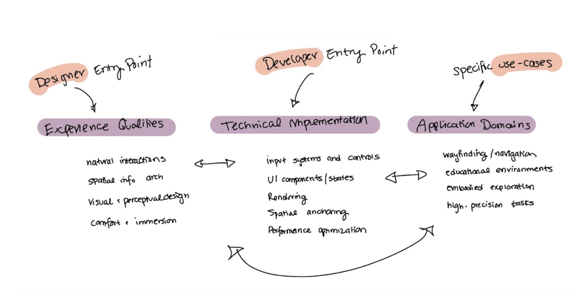
Before talking to anyone, I dug into academic papers and design articles to understand the current landscape. The paper Virtual Reality User Interface Design: Best Practices and Implementation (Mehmedova et al.) explicitly states there's a lack of unified design guidelines for XR and proposes categories like general VR principles, ergonomic design, onboarding, and cybersickness prevention.

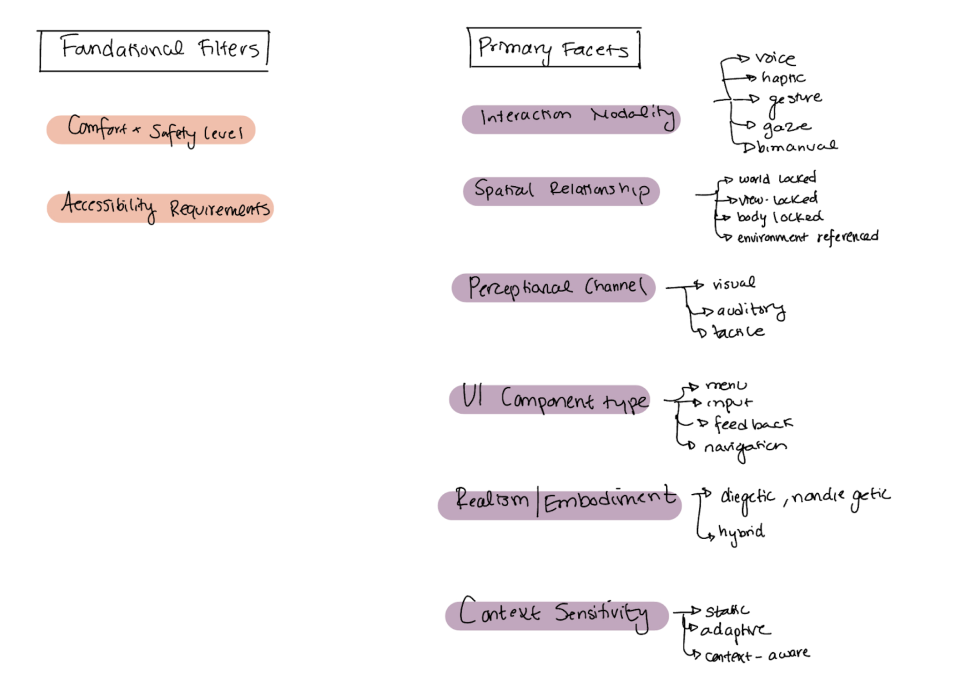
Davari's Towards Context-Aware Adaptation in Extended Reality offered a different lens, organizing XR interfaces by how they adapt to context through content design, presentation design, and input design, helping me see XR elements as interconnected systems rather than isolated components. Finally, Sahu's practitioner-focused article "Designing for the Immersive World: A UX Designer's Guide to AR, VR, and XR" provided a more approachable framework organized around devices, core UX principles (accessibility, comfort, spatial information, natural interactions), and use cases.

These gave me some critical insights: there's no standard way to organize XR knowledge, different frameworks serve different purposes, and the best approaches acknowledge that XR design is contextual and interconnected. But the literature didn't tell me how actual designers and developers think about organizing this information when they're doing their work? That's where user research came in.

User Interviews

I conducted 6 in-depth interviews, 3 designers and 3 developers from Carnegie Mellon and UC Berkeley who have experience working on XR projects. I wanted to understand how they conceptualize interface components, what resources they use, and how they make design decisions.

Then card sorting

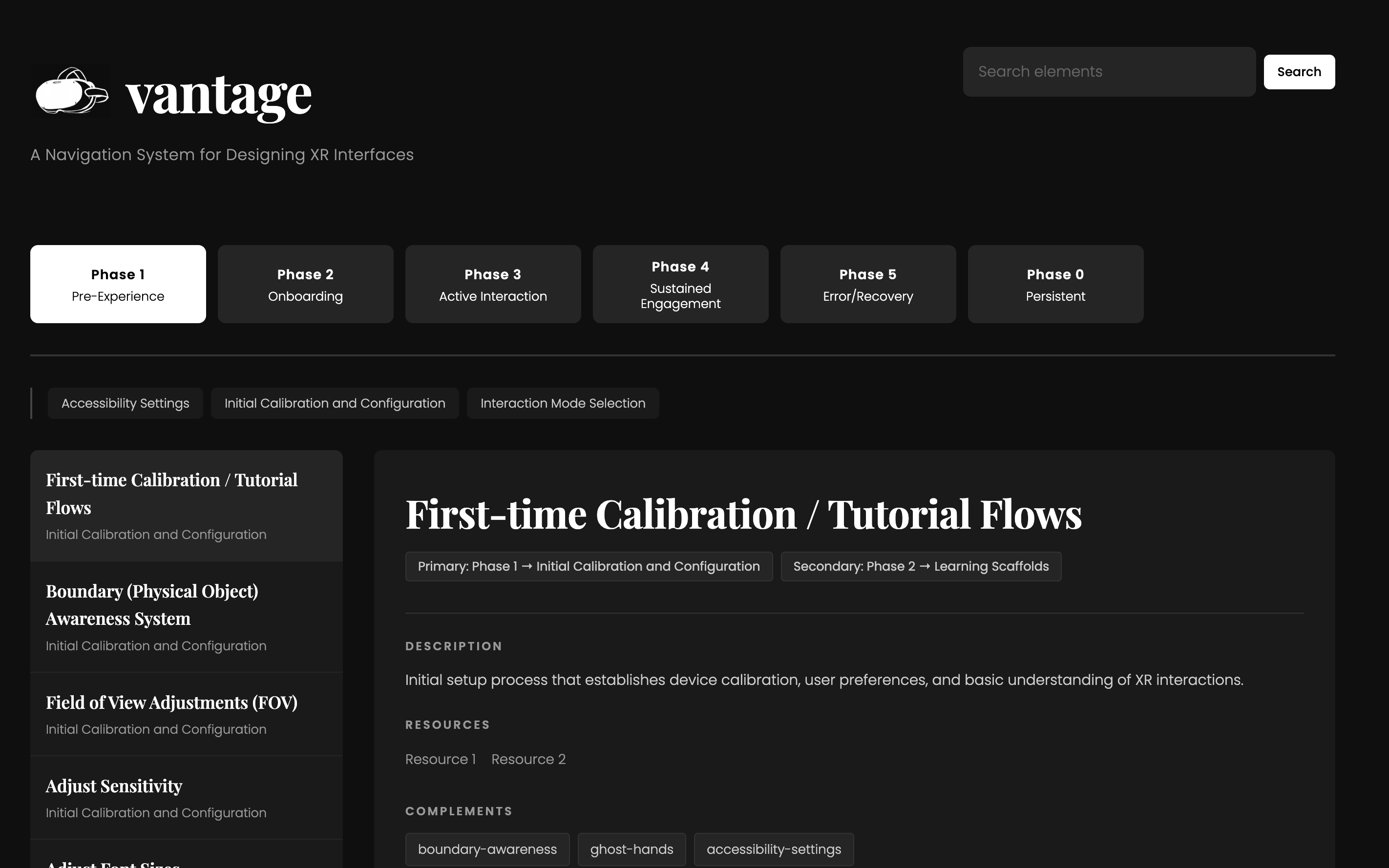
I had participants organize 105 XR design elements into categories that made sense to them. I gave them cards with terms like "gaze control," "radial menus," "boundary feedback," "motion sickness prevention", all the nitty-gritty stuff that goes into designing XR experiences.

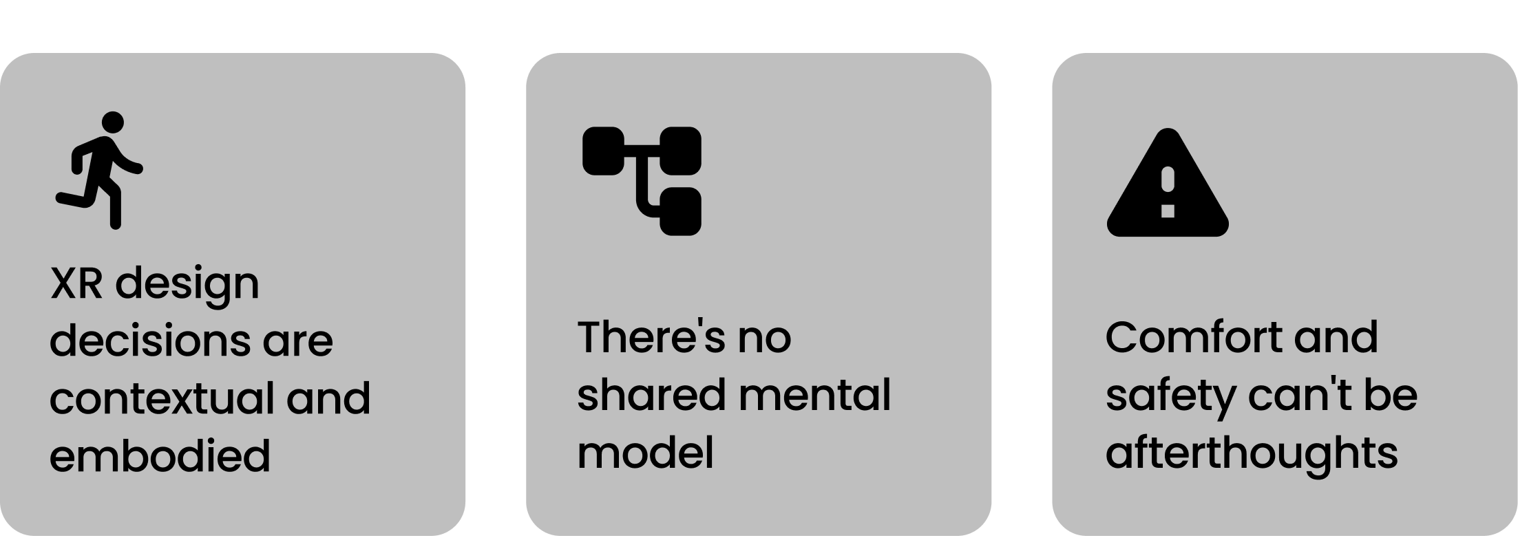
The messiness was actually the most critical insight. XR elements don't fit into neat boxes because the decisions are contextual, embodied, and interdependent.

Research insights

Ideation

Exploring different directions.

Based on what I learned, I sketched out three different approaches to organizing XR design information. Each one tried to address different aspects of what I'd heard in the research.

Direction 1

Multi-dimensional Faceted System

Create a system where each XR element can be tagged across multiple independent dimensions. Start with safety and accessibility filters, then progressively narrow by interaction type, spatial relationship, UI component type, etc.

Direction 1: Multi-dimensional Faceted System

Challenge: Would require consistent tagging across many facets. Complex to maintain and might replicate the fragmentation problem we're trying to solve.

Direction 2

User Journey Architecture

Organize XR elements according to when and how they're encountered in the user experience. Match the structure to actual design workflows—setup, onboarding, active use, sustained engagement, error handling.

Direction 2: User Journey Architecture
Selected

Matches how users actually think and work. Creates clear entry points without oversimplifying the complexity. Feasible to implement and test.

Direction 3

Role-based Entry Points

Multiple parallel taxonomies connecting to the same knowledge base. A designer view might see "gaze-based control" under natural interactions, while a developer sees "eye tracking implementation" under input systems.

Direction 3: Role-based Entry Points

Challenge: Maintaining parallel taxonomies and a complex knowledge graph. High implementation cost and might not effectively solve the scattered information problem.

Implementation

A journey-based navigation system.

Organizing XR design elements by when they matter in the user experience

I built Vantage around six phases that map to both the designer's workflow and the user's journey through an XR experience. Each phase represents a distinct context where different design elements become relevant.

Phase 1

Pre-Experience Setup

Foundation for safe, accessible, and personalized XR use

Before anything else, what device are we using? What accessibility settings need to be configured? It's important to get these answers first before moving forward to ensure designers consider safety and inclusivity from the start.
Phase 2

Onboarding

Introducing users to XR interaction patterns

First-time tutorials, ghost hands showing gestures, contextual hints, spatial orientation cues. This is when users build their mental model of how to interact with this new environment.
Phase 3

Active Interaction

Primary engagement with XR content and interface elements

The meat of the experience: input methods (hand gestures, gaze, voice, UI components (buttons, menus), spatial navigation. Organized by what users are actually doing.
Phase 4

Sustained Engagement

Supporting prolonged use

Guiding interactions, travel mechanics, techniques for managing complex interaction techniques. These elements become important as users spend more time in the experience and start doing more sophisticated tasks.
Phase 5

Error + Recovery

Handling mistakes and system failures

Error states, undo options, recalibration flows. Often under-documented but critical for real-world use.
Phase 6

Persistent Considerations

Elements that span the entire experience

Accessibility, cybersickness prevention, comfort, safety, privacy. These aren't confined to a single phase—they're continuous concerns that influence everything.

The relationships between phases and elements

Each element in Vantage includes a metadata schema that captures relationships and context. For example, 'Radial Menus' contains:

Radial Menus

This metadata creates a web of relationships without forcing everything into a single rigid hierarchy. Elements can appear in multiple phases, reference each other, and carry important contextual information that helps designers make informed decisions.

Implementation

The system development

I started building out the actual system using JSON to structure the data. Each of the 110 elements gets its own entry with all the metadata which is... a lot of work to implement.


I also designed an interface in Figma that shows how designers would actually navigate this system. You can browse by phase, search for specific elements, and see how different components relate to each other. The goal was to make it feel less like reading documentation and more like exploring a knowledge space.

Reflection

Learnings...

I also learned that sometimes the messy, contextual nature of a domain is a feature, not a bug. XR design elements don't fit into neat categories because decisions are inherently interconnected.


Working on this project reinforced my belief that good information architecture is deeply user-centered work. You have to organize them in ways that match how people search, learn, and make decisions.

With more time...

The obvious next step is completing the entire set of 110 elements and test it with XR designers to see if the journey-based organization actually helps them find what they need.


I'm curious about adding scenario-based entry points on top of the phase structure. Like, "I'm designing a training simulation" or "I'm building a social VR experience", different use cases that would surface relevant elements across multiple phases.

Overview
Research
Ideation
Design
Reflection
Context-Aware VR Interfaces

view another project

Context-Aware Virtual Reality Interfaces

Developing an LLM pipeline to build personalized context-aware AR/VR interfaces.

Research LLMs AR/VR
×